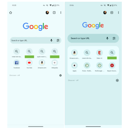
Google is giving a makeover to its Chrome, which makes the new tab page more user-friendly. Yes, the latest update makes the search bar thicker, and hint text bolder. Simultaneously, the voice microphone and Lens icons look more distinct, with a smaller Google logo.
As per the details, Chrome is a frequently visited 4×2 grid site, which is now placed in a rounded card that helps to distinguish the section. Not only this but there are similar tweaks to the Discover and Following switcher, while the feed itself appears unchanged.
However, this little yet notable change is rolling out with version 119 and it is currently available for limited users. Therefore, we can see its wider rollout in the coming weeks. Do you like this change, or are enjoying the previous shrunk search bar, let us know in the comment section below.